This project includes…
Website Design
Interaction Design
Website Designs
Project 1:
OHMA
Ohma is a company that focuses on the customization of microphones. Their goal is to stand out from the monotonous look and feel of the products in their industry by allowing their customers to create something uniquely theirs. With a new look and feel to microphones, they hope to target a creative generation and help them capture their sound.
Solving the Problem
The purpose of this project was to create a customization workflow for how a customer would navigate creating and purchasing a microphone. This had to solve the problem of highlighting the customization aspect and making an easy workflow for the user to complete this. There was also the problem of gaining traction and attention to gain an audience. I learned that it is important to look at a process in different ways, especially when there are multiple steps or options in a workflow.
Attracting Millenials and Gen Z
The users are a younger generation ( teens to thirties) of musicians, podcasters, and creatives who want to stand out. These are people who often resort to creating makeshift studios in their homes and relying on social media to increase their following. They are people who appreciate uniqueness and look to share their new finds and creations.
My Roles
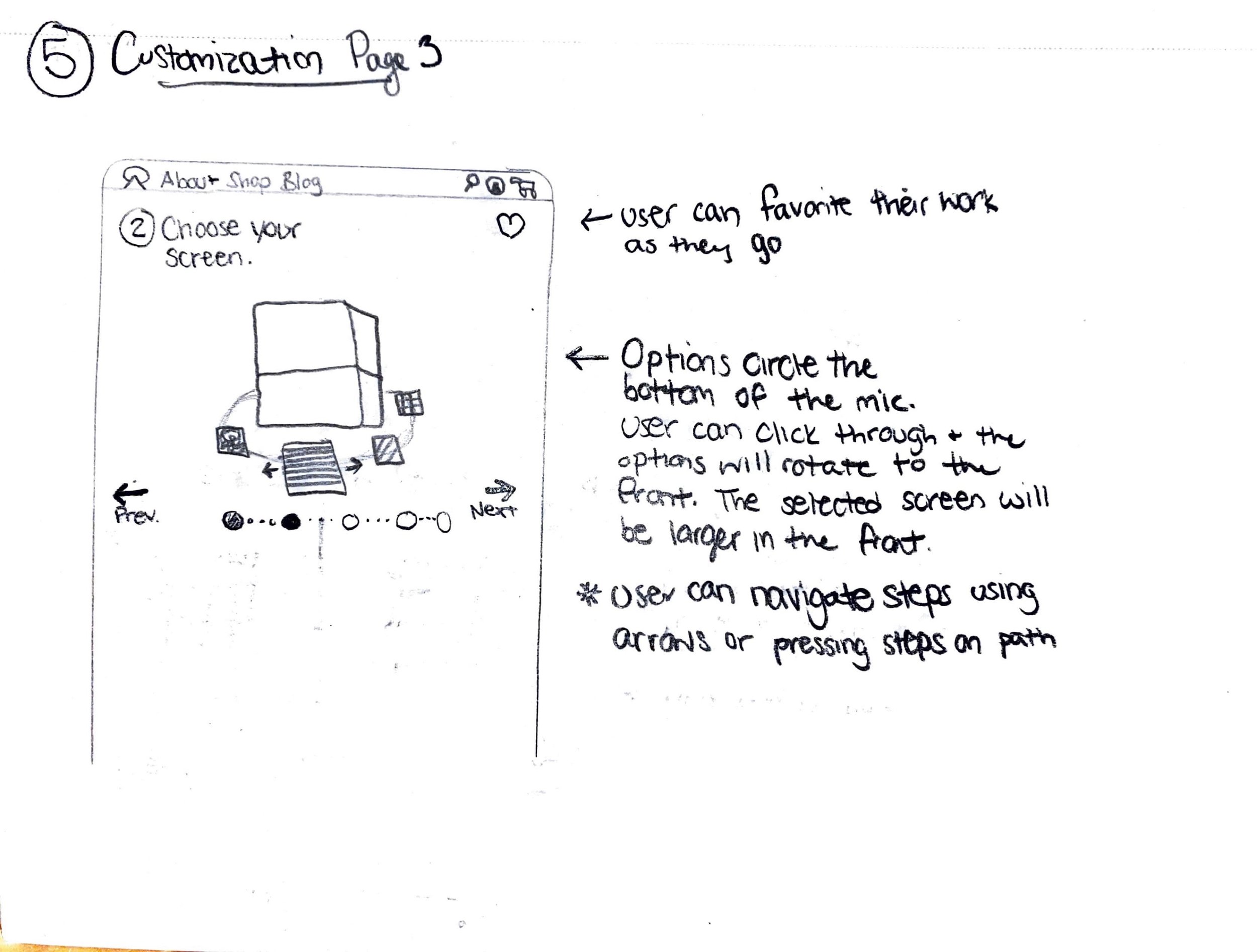
I learned about the brand and its creators through remote meetings and learned about the microphones through meeting pro audio engineers. I then conducted research to get inspiration from other websites. I then ideated thumbnail sketches for options of my workflow. With the guidance of my professor, I created prototype wireframes in XD. I laid out my basic ideas while linking pages to see a working workflow. For some prototyped aspects, like creating a 3D transition, I got help from my professor. My prototypes were then tested with usability tests to see if they were understandable. I then met again in a class setting with the brand creators where they provided and explained their brand materials. Using these, I plugged in the assets to create a working website for Ohma, and gained feedback and edits from my professor.
Limitations
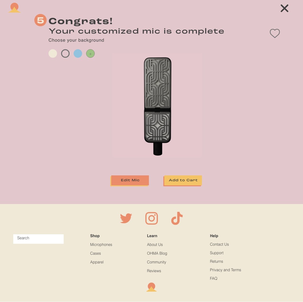
I had the course of the semester (15 weeks) to complete this project. The clients were still developing and editing the brand identity as I was creating the process, so I did not have assets like product names, copy, or brand assets to begin with. I had a limited amount of time and communication with the clients. The clients were able to later provide the branding, product images, and 3D imaging sequences to complete the site. The provided branding included color palettes, type choices, and product images of the microphones with transparent backgrounds and while in use.
The Steps
I began this process by gaining insight into the company by interviewing the clients and users who have beta tested the microphones. After learning about the products, I conducted research about other website layouts and company designs. I created thumbnail sketches to ideate the user workflow and layout design. These turned into prototype wireframes in XD, with simple shapes and forms and conducted usability tests with these prototypes to gain feedback on the prototypes. I then met with the clients again to learn about their branding and to gain access to branding assets. These were used in the revised prototypes with the full branding identity.
The Process
The Pages
Visit the interactive prototype to view, click, and scroll through all of the pages on the website!
This project includes…
Website Design
Interaction Design
Project 2:
The Hub
I redesigned the internal website for DIAM. This website is used as an intranet portal for the employees' internal operations of DIAM. This design focused on simple, modern, and modular themes to account for the pages that were heavy with information and data.


