This project includes…
Packaging Design
Logo Design
Tea Packages
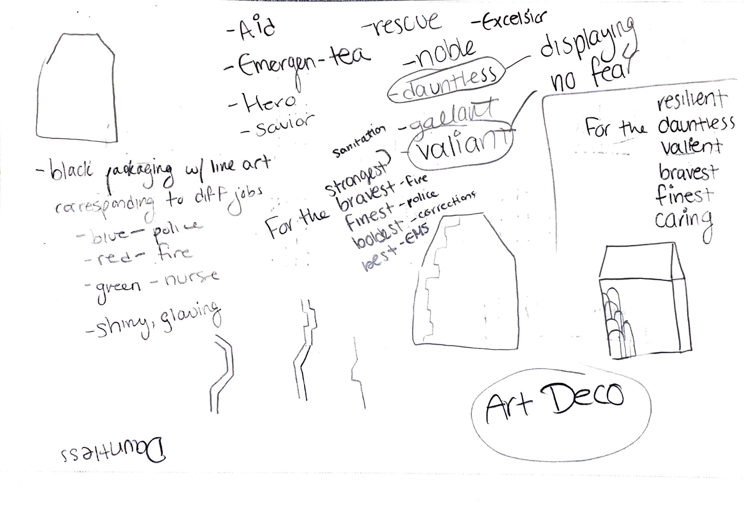
The brief for this project was to create a fictional tea brand for a specific audience. The original intended audience was first responders. This audience consisted of tough, brave people, based on "New York's Finest" or "New York's Bravest." For the people who displayed no fear, I named the brand “Valient.” This brand included an Art Deco style packaging as a homage to New York skyscrapers. The packaging was intended to be bold, strong, and regal, with the different colors representing different emergency units, like red for firefighters and blue for police. This idea was inspired when my Uncle, who is a firefighter, told me that he only drinks tea, but in the firehouse, it is more common to drink coffee. The packaging for many tea brands are often frilly and in this environment, that was embarrassing. That’s why I made this brand feel bold.
The brand direction was changed to be a more modern, simple, and bright design. The new branding was named “Gaia,” the goddess of the earth. This represented the natural and clean ingredients used in the tea product.


